
Digital products today are evolving rapidly not only in functionality, but also in visual style. As user expectations grow, there’s increasing demand for sleek, immersive interfaces that blend innovation with usability. Designers are now moving beyond flat and minimalistic UI, exploring richer and more dimensional approaches.
One trend gaining significant traction is “liquid glass” design. As an evolution of glassmorphism, it incorporates fluid translucency, subtle gradients, and reflective light to create depth and tactile realism. Inspired by real-world textures like frosted glass and holographic materials, this style has become a favorite among designers aiming to craft futuristic, polished digital experiences.
Apple has played a vital role in advancing this aesthetic. From macOS Big Sur’s translucent layers to the more recent system-wide implementation of Liquid Glass across iOS 26 and macOS Tahoe, Apple’s design systems prioritize spatial layering and intuitive navigation. Apple’s official documentation on Liquid Glass, which provides developers with specific guidance and examples for implementing these effects effectively in Apple’s ecosystem outlines how the company integrates transparency, layering, and subtle motion to build a sense of depth and clarity in its interfaces. This guidance confirms that liquid glass is not just an aesthetic choice, but a deliberate design strategy embedded in Apple’s system-wide UI standards. The growing adoption of liquid glass by industry leaders affirms its place is a validated and strategic part of modern UX.
In this article, we explore the origins and defining features of liquid glass, why it continues to grow in popularity, how designers can master the style in Figma, and the UX principles that ensure both beauty and usability are preserved.
What Is Liquid Glass Design?

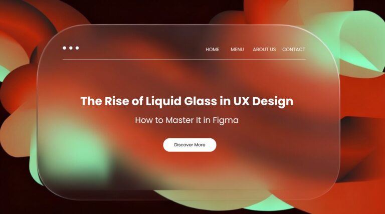
Liquid glass is a visual design trend that emulates the appearance of fluid, frosted, and translucent glass surfaces. It blends elements of glassmorphism (blur, transparency, depth) with characteristics of fluid motion and reflective textures, creating a dynamic and visually rich interface.
Liquid glass uses subtle gradients, reflections, inner glows, and light diffusion to suggest materiality, making UI elements feel more tangible and interactive. The style is particularly popular in digital products seeking a modern, high-tech, or futuristic aesthetic.
The Characteristics of Liquid Glass:
- Semi-transparent layers with soft background blur
- Frosted surfaces with gradient overlays
- Glossy highlights or internal reflections
- Fluid, curved shapes or glass-like containers
Why Liquid Glass Is Trending in UX Design
Liquid glass is gaining traction for both aesthetic and functional reasons. It offers designers a way to create interfaces that are visually appealing without sacrificing structure or clarity.
Visual appeal
The smooth, layered look stands out, giving products a premium, futuristic feel.
Functional layering
Glass-like surfaces provide contrast between background images or videos and key content without blocking visibility.
User engagement
The tactile quality of the design can make interfaces feel more immersive and interactive.
This trend has been widely adopted in fintech dashboards, Web3 apps, mobile interfaces, and landing pages. Leading platforms such as Apple’s iOS and Microsoft’s Fluent Design System have incorporated glass and blur effects into their UI kits, setting a precedent for mainstream adoption.
How to Create Liquid Glass Effects in Figma
You don’t need complex software to design with liquid glass. Figma offers all the tools you need. Here is a step-by-step guide to get started:
Step 1: Create Your Base Layout
Start with a background layer using either a photo, gradient, or soft illustration. This layer will interact visually with your glass elements.
Step 2: Draw the Glass Element
Use the shape tool to draw a rectangle or rounded card. Set the fill color to white with 10–30% opacity. This creates the base of the glass look.
Step 3: Apply Background Blur
Go to the “Effects” panel in Figma, choose “Layer Blur” or “Background Blur,” and adjust the intensity (between 10 and 30 works well).
Step 4: Add Stroke and Inner Shadow
Add a subtle white stroke (1px) to define edges. Then apply a light inner shadow or gradient fill to simulate depth and light diffusion.
UX Best Practices & Tools for Liquid Glass Design
Liquid glass, while visually striking, should never compromise usability. To achieve stunning yet functional liquid glass interfaces, keep these core principles in mind, and leverage the right tools:
Core UX Principles for Liquid Glass:
1. Maintain Accessibility
Always check color contrast and readability of text and elements over blurred surfaces. Ensure your design provides clear alternatives for users with motion sensitivity or visual impairments.
2. Avoid Overuse
Utilize liquid glass sparingly to highlight only key UI components. Too much blur or transparency can lead to visual clutter and distraction.
3. Design for Performance
Thoroughly test how blur and transparency effects impact rendering performance on various devices, especially older models, to prevent lag.
4. Prioritize Clarity
Always ensure essential content and interactive elements remain easy to read and interact with, even when layered beneath or interacting with glass effects.
Essential Tools & Resources for Figma:
To effectively implement liquid glass design, explore these powerful tools and plugins within Figma:
1. Background Blur
Utilize Figma’s native Background Blur effect for the core transparent, frosted look.
2. Noise & Texture Plugins
Enhance realism with plugins that add noise and subtle textures for a frosted or grainy glass effect.
3. Glassmorphism UI Kits
Accelerate your workflow with pre-built Glassmorphism UI Kits available on the Figma Community.
4. Gradients, Blobs, & Overlays
Create vibrant backgrounds and dynamic shapes using resources like uiGradients, Haikei, or SVG background generators to make your liquid glass pop.
Partner with Flow Digital to Elevate Your Web Design
Liquid glass design offers a compelling opportunity to craft visually rich and emotionally engaging digital products. When applied thoughtfully and supported by sound UX principles, it strikes the perfect balance between aesthetics and functionality. As tools like Figma continue to democratize access to these advanced design techniques, there has never been a better time to experiment and push creative boundaries.
At Flow Digital, we help brands transform these ideas into fully realized solutions. From building immersive websites to designing user-centric applications, our team of experienced designers and developers collaborate closely to deliver products that are not only beautiful but also strategic and scalable. Whether you’re launching a new digital experience or refreshing your existing interface, we offer customized solutions tailored to your brand, audience, and goals.
Ready to bring next-level UX to your project? Contact The Flow Digital Team and let’s build exceptional digital experiences together.