Creative designing helps provide an effective way to convey proper messages to audiences. A thorough analysis of the market by Flow Digital helps Monette Ansley dictate the art direction for their branding.
Summary
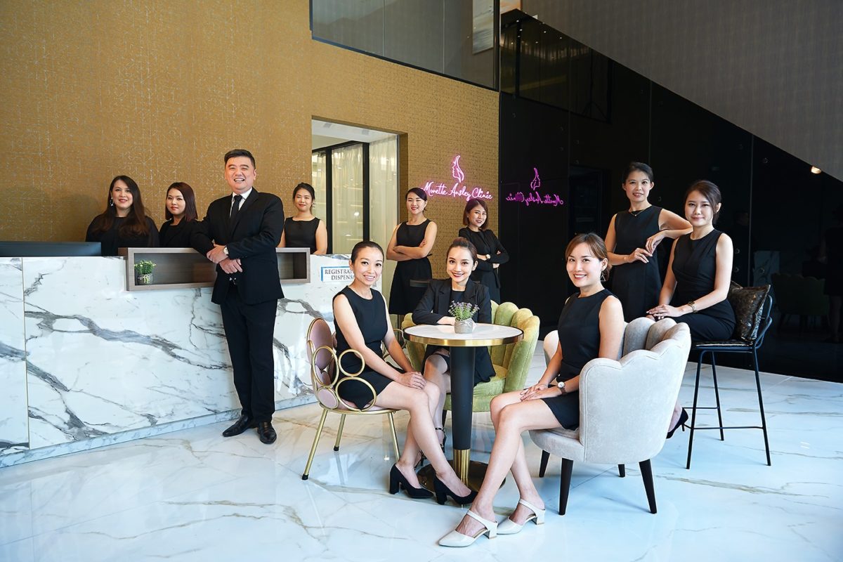
Monette Ansley aesthetic clinic needed a proper way to communicate with their potential target market through their marketing collateral such as brochures and leaflets.
Flow Digital gave Monette Ansley a thorough review and redesign for their marketing collateral. An in depth market analysis together with Monette Ansley has helped us convey a more enticing and effective communication and messaging style through our personalized graphic designs.
Challenges
As a flagship aesthetic clinic, Monette Ansley’s offers a big variety of aesthetic treatments and services. New and inquiring customers often get confused at the initial point of contact. Effective marketing collaterals will be useful to break down and highlight their services. However, they do not have an in-house design team, and they lack the art direction needed to create visually appealing and impactful marketing collateral.
Our Role

Graphic Designer

Banner Designer
Project Manager
Our Approach
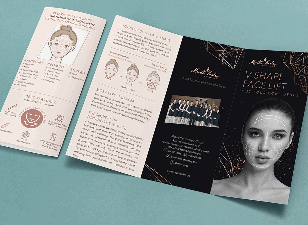
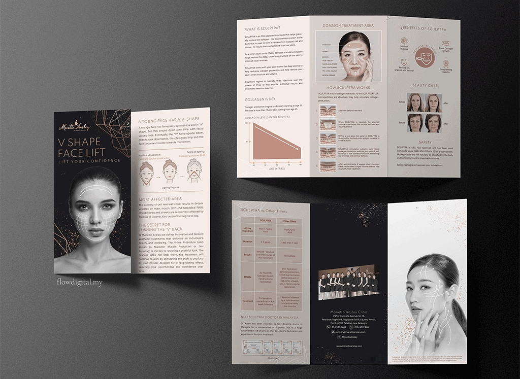
After identifying their target audience, we began to set the art direction for their branding and planned out the marketing collaterals needed. We organised and standardised the brochures for the different services provided at Monette Ansley. We also handled the designs for their marketing collateral which includes the illustration and management of content. Aside from the artistic aspect, we also ensured professionalism and accuracy of the brochure designs. We restructured the names of their treatments and proofread all content.
The Process:
- Understanding the Target Audience: Through market research, we observed that the target audience were working and matured ladies who have a reasonable disposable income and spending power.
- Establishing the Brand Tone: Working closely with the Monette Ansley team, we established that the company should have a premium, matured and professional tone and aesthetic to capture the interest of the target audience.
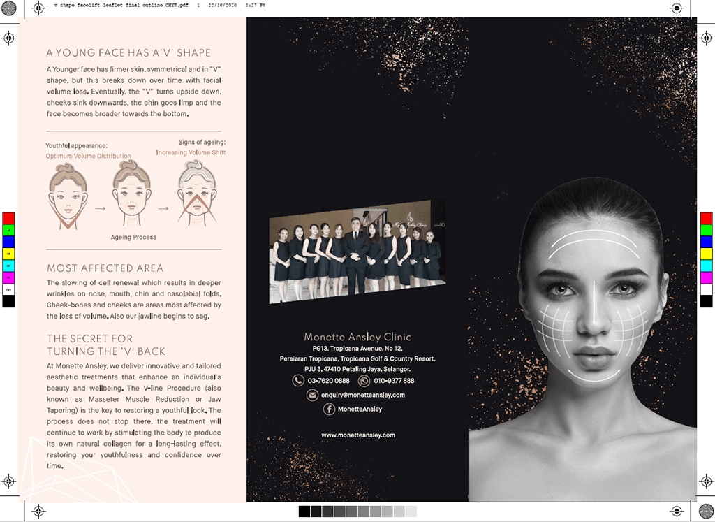
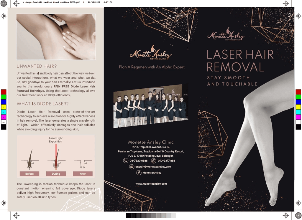
- Setting the Art Direction: We used darker tones with a combination of rose and nude shades, which brought out the premium and professional vibe with a tinge of femininity.
- Finalizing and Printing the Brochure Designs : In line with the brand tone and art direction, the brochures were printed with a high quality spot UV and matte finishing.
The Result
We successfully standardised the styles and identity of Monette Ansley with the colour schemes and typography. It made their communication more consistent and the message easy to understand for their customers. The printed collaterals made the explanation of their offered treatments clearer and more coherent. These uniquely designed media has also helped Monette Ansley differentiate themselves from their competitors, giving them the edge they needed to stand out.