
Picture this: you’re on a research mission, looking into the depths of the internet for that crucial piece of information.
You click a promising link on Google, only to be sent into a rabbit hole of subcategories, each requiring another click.
Navigating back and forth, your frustration builds as you go through a maze of confusing menus and buttons.
Finally, you give up.
You’ve already wasted enough time on this website; time to look at the next search result.
This is the consequence of poorly designed website navigation.

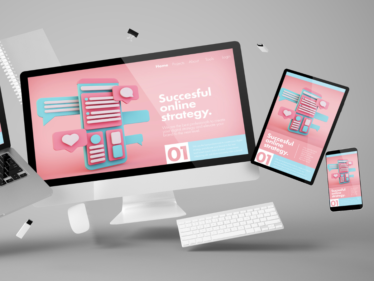
Whether browsing on a sleek desktop monitor or a tiny smartphone screen, smooth website navigation is not an optional feature, but an imperative element to keeping users on your website.
Without keeping navigation at high standards, you’re increasing chances that your website visitors will leave after a bad user experience.
This article will be your guide to crafting a responsive navigation structure, unlocking the secrets to user satisfaction and website success.
We will cover 5 areas of responsive navigation in a website that will define your platform’s user friendliness and ultimately, your customer count, specifically:
- Best Practices for Responsive Web Menu Design
- Navigational Elements for Small Screens
- Multi-Level Navigation in Responsive Design
- Integrating Icons and Cues for Intuitive Navigation
- User Testing and Feedback
Fundamentals of Responsive Navigation
First of all, we have to understand what navigation in a website means for a user.
Navigation acts as the map and compass for your website, guiding users to the specific knowledge they seek. Its design plays a crucial role in shaping their entire experience, influencing everything from engagement and satisfaction to conversions and brand perception.
Let’s imagine a library as your website. At its core, website navigation involves three key elements:
1. Navigation Structure
The overall organisation of your website’s content, typically built around hierarchies and categories. Imagine them as bookshelves neatly arranging different sections in a library, each separated by genre.

2. Clear Labels
Textual or visual cues that guide users to specific areas. Think of them as clear and concise titles of each book.

3. Interaction
Mechanisms users employ to navigate between different pages and sections. Clickable menus, buttons and search bars are all common examples, acting as the tools users utilise to move around the library or access the books they are looking for.
Now, think of all this in the perspective of users who are accessing your website from different devices.
In the cross-device digital era, website designers now have to take into account how websites should be designed for different sized devices and how it would affect the user experience.
This is especially true with website navigation design.
Some common challenges of responsive design with website navigation include:
Cramming all your navigation options onto a smaller smartphone screen without overwhelming users becomes a delicate balancing act.
Prioritising and organising content becomes crucial to ensure users find what they need quickly, even with less real estate.
Touch-based interactions on mobile require different considerations compared to mouse-clicks on desktops.
Ensuring equal access and usability for users with disabilities across diverse devices adds another layer of complexity.
By understanding the challenges involved, you can craft responsive navigation that empowers users to explore your website effortlessly, regardless of their device.
Let’s move on to explore specific strategies and best practices for mobile-friendly web menu designs.
Best Practices for Responsive Web Menu Design
Menus act as the gateway to your website’s content; and on mobile devices, where space is precious, their design becomes even more critical.
Here are some best practices to ensure your mobile menus are intuitive and keep your visitors engaged:

1. Embrace Simplicity
Less is often more.
Prioritise essential website navigation items and eliminate clutter. Aim for clear labels, intuitive icons and concise descriptions.
2. Prioritise and Hide
Not all content needs to be readily accessible.
Identify the most used features and place them prominently. Less frequent options can be tucked away in a secondary menu or revealed through progressive disclosure (e.g., tapping “More”).

3. Embrace the Hamburger
The humble hamburger menu (☰) has become a mobile navigation staple.
Make sure it’s easily discoverable and clearly indicates the presence of hidden navigation options. Remember, even though it’s compact, make it tappable!

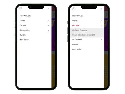
4. Leverage Accordions
For deeper hierarchies, accordions (collapsible menus) offer a space-saving solution.
Users can expand sections relevant to their needs, maintaining a clean and uncluttered interface.
5. Touch-Friendly Design
Optimise everything for thumbs!
Ensure buttons and links are large enough for easy tapping, with sufficient spacing to avoid accidental clicks. Remember, your users are interacting with a smaller screen, so cater to their specific needs.
6. Test and Iterate
Responsive design is an iterative process.
Test your menus with real users on different devices and gather feedback. We cover this concept in more detail further down the article.
By following these best practices and considering the challenges of mobile navigation, you can create menus that empower your users and guide them effortlessly through your website’s rich content, leading to higher engagement and satisfaction.
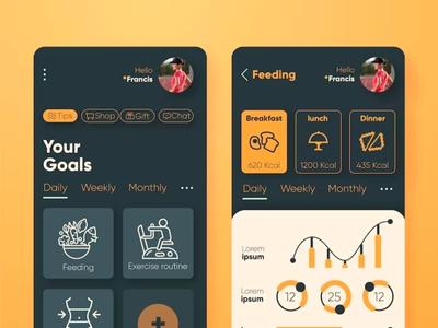
Navigational Elements for Small Screens
Smaller screens on smartphones and tablets does not just mean shrinking elements.
It’s about adapting functionalities and leveraging design principles to create an exceptional user experience on limited real estate.
Thankfully, you don’t have to think of new ways from scratch to make navigation easier on mobile devices.
Here’s a toolbox of essential elements that work well with mobile navigation:

Search Bars
Empower users to quickly find specific content through intuitive search functionalities optimised for touch input.
Tab Bars
Provide easy access to core categories or actions with clear icons and labels. Imagine them as miniature navigational beacons guiding users to key destinations.
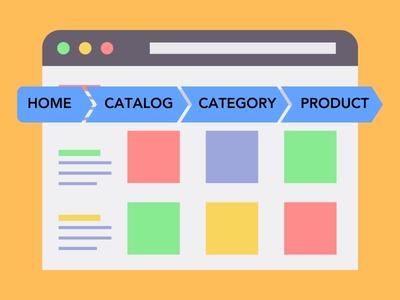
Breadcrumbs
Show users their current location within the website hierarchy, helping them retrace their steps or jump to higher levels. Think of them as helpful landmarks offering a sense of orientation on your digital map.

Progressive Disclosure
Reveal additional options and functionalities only when needed, keeping the interface clean and focused. Consider this a way to avoid information overload and prioritise user needs effectively.

Touch Gestures
Embrace swipe gestures and other touch-based interactions that feel natural and intuitive on mobile devices. This streamlines navigation and adds a layer of dynamism to the user experience.
By understanding these elements and how to implement them effectively, you can unlock the potential of responsive navigation and design websites that truly shine on small screens.
After all, mobile users account for over 55% of all web traffic, making it an audience you cannot ignore if you’re looking to maximise your platform’s reach.
Multi-Level Navigation in Responsive Design
Websites that have a large number of pages, such as ecommerce sites, often come with multiple layers of categories, product variations and menus.
In cases like this, multi-level navigation becomes a challenge for all devices to ensure a smooth user experience.
For portables like smartphones and tablets, this leads to a few key responsive design considerations:
Presenting multiple nested menus without cluttering the interface requires careful design considerations.
Too many choices can paralyse users, making it difficult to find what they need quickly.
Traditional dropdown menus might not translate well to touch-based interactions on mobile devices.
With limited screen space, you want to avoid creating chaos when users access your website.
Collapsible and expandable menus are essential tools for organising complex website structures on smaller devices.
Here are some key techniques to consider:
Mega Menu Mastery
- For intricate hierarchies, consider well-designed mega menus. These offer a visual overview of subcategories within a hover or tap.
- Remember, information overload is the enemy. Keep things clear and concise without too much content.
Design for Thumb-Friendly Interactions:
- Ensure all navigation elements, including buttons, links, and icons, are large enough for easy tapping with thumbs. Aim for a minimum target area of 48×48 pixels.
- Place frequently used navigation elements within the “thumb zone,” the easily reachable area of the screen between the thumb and the opposite side of the hand.
Breadcrumbs are Your Friends
- Don’t forget the breadcrumbs! They offer users a sense of location and allow them to easily navigate back to higher levels within the hierarchy.
- Ensure breadcrumbs are visible and accessible even when menus are collapsed.

Animation for Smooth Transitions:
- Use subtle animations to enhance the user experience when expanding/collapsing menus. This adds a touch of polish and helps users visually understand the action.
- Avoid complex or distracting animations that might slow down loading times.
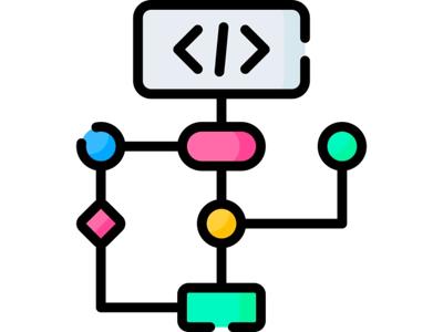
Integrating Icons and Cues for Intuitive Navigation
Imagine navigating a bustling marketplace without any signs or landmarks in a foreign country. Without any understanding of the local language, you could get hopelessly lost.
Websites, especially on mobile screens, can feel similarly overwhelming without clear visual cues.
This is where icons and visual elements shine, acting as a universal language that transcends language barriers and cultural differences.
So why do visuals on websites matter?

Humans process visuals faster than text, grasping the meaning and purpose of navigation elements at a glance.
Icons and visual cues can bridge language barriers and cultural differences, making your website accessible to a wider audience.

Clear and consistent visual cues reduce cognitive load and help users navigate more intuitively, especially on smaller screens.

Well-designed icons can visually represent your brand and enhance its overall identity.
Making or breaking your website’s navigation structure then depends on how well you integrate visuals to represent what actions you want users to take. Choose icons that are simple and universally understood, maintain a consistent visual style for branding and know what key functions to prioritise in your navigation bar.
Also keep these concepts in mind when creating your navigation structure:
- Colour Coding: Use colour strategically to differentiate categories or highlight important actions. Remember, colour can also evoke emotions, so choose wisely!
- Microinteractions: Subtle animations or hover effects can add visual interest and provide feedback on user interactions, enhancing the overall experience.
- Visual Hierarchy: Use size, placement, and visual weight to guide users’ eye towards the most important navigation elements.
User Testing and Feedback

Who better to know what they like than your audience themselves?
While you can do as much as you can to optimise your website, designing in an enclosed environment will not bring any insights into how your target audience uses your website.
User testing and analytics helps to shine a light that reveals how users truly interact with your navigation and empowers you to continuously improve based on true data.
So whether you are launching a new website for the first time or looking into how to improve your current website navigation design, follow these simple steps:
1. Define Your Goals
What aspects of your navigation do you want to test? What questions do you need answered?
2. Recruit Your Users
Select a diverse group of users representative of your target audience.
3. Conduct the Test
Utilise various testing methods like usability testing, surveys, and A/B testing to gather data.
4. Analyze & Synthesize
Make sense of the data, identifying key patterns and user pain points.
5. Prioritise & Iterate
Based on your findings, prioritise improvements and implement changes to your navigation.
6. Test & Repeat
The cycle never ends! Regularly test your navigation and iterate based on user feedback to ensure continuous improvement.
Quality data and feedback cannot be gained in a vacuum. Besides your users, also consider involving other stakeholders to test your website navigation design for usability, whether it’s your marketing and sales team to business developers and managers.
By getting as many viewpoints from different people in your organisation, you gain a holistic perspective on both a user’s needs and also your organisation goals. This then becomes indispensable to informing your design adjustments.
Get A User-Centred Website With Flow Digital
By following these principles and embracing a user-centered approach, you can craft a responsive website navigation structure that becomes more than just a technical feature; it becomes a cornerstone of a positive user experience, fostering engagement and loyalty. Remember, intuitive website navigation isn’t just a design choice, it’s a commitment to your users.
If you’re looking for a reliable website design service that prioritises user experience across desktop, smartphone and tablet, you can consider Flow Digital’s professional UI/UX design service.
Whether you’re looking for a new website, a revamp or dedicated mobile app, we ensure all our designs are ready to impress and lead your potential customers through your conversion journey.