
In the early days of the Internet, websites were built with a focus on technical prowess and functionality. User experience had not yet been something that was considered in website building.
Imagine a world where websites were cluttered with text, images loaded slowly and navigation felt like getting lost in a maze. This was the reality before user-centred design emerged, fundamentally changing how we approach website creation.

What’s more, with new technologies like smartphones and tablets being developed relatively recently, you also have to consider the importance of the responsive designs of your platform.
That is why utilising user feedback and a user centred design approach is so crucial to the success of online platforms now: it puts your users first to create the best experience for them.
In this article, we will be covering how to adopt a continuous improvement approach for user centred design and responsive web design, and how to gather the right data to inform your changes.
Let’s dive in!
User Centred Design with Website Building
Generally speaking, user centred design is a philosophy that places the user at the beginning of the entire process when designing a product.
With websites, it requires web designers and builders to understand user needs, behaviours and expectations to create websites that are not only visually appealing but also intuitive and easy to use.
At the core of it, a user centred design approach emphasises on:

User Research
Through research methods like surveys, interviews and user testing, gathering valuable data on user needs, behaviours and pain points helps to inform every stage of website development.

Information Architecture
Organise website content in a logical and user-friendly way, making it easy for users to find the information they need through intuitive website navigation.

Usability Testing
Usability testing with real users is a core principle of user centred design. By observing how users interact with the website, you can identify and address usability issues before and after launching your platform.

Accessibility
User centred design ensures websites are accessible to everyone, regardless of their abilities. This includes considerations for users with visual impairments, motor limitations and cognitive disabilities.

Optimising for Different Devices
The mobile world pushes user centred design to adopt responsive layouts that are easy to navigate and use on various devices. This includes optimising font sizes, button placements and overall content structure for different screen sizes.
By integrating these principles throughout the website building process, you can create responsive websites that are not only technically sound but also user-friendly and cater to the needs of your target audience across all devices.
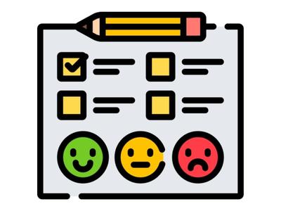
Gathering User Feedback and Data

Effective user feedback allows you to refine your responsive design and ensure it caters to the needs of your target audience across various devices.
A website can look great but feels clunky and frustrating to navigate, and often that’s only revealed after it’s been used. User feedback specifically gathered bridges this gap by providing valuable insights directly from the users themselves.
Strategies and Tools for Gathering User Feedback

Moderated User Testing
Conduct user testing sessions where participants interact with your website on various devices (desktop, tablet, smartphone) while a moderator observes and asks questions. This allows you to identify usability issues specific to each device.
Suggested Tools

Remote User Testing Tools
Several online tools provide remote user testing where participants access your website on their devices and record their experience with screen recording software or heatmaps. This can be a cost-effective way to gather feedback from a wider range of users.
User Surveys
Utilise survey tools that allow you to target people accessing your website. This enables you to gather feedback directly from users on their experience with your website and helps identify certain pain points.
Suggested Tools

Website Analytics
Many website analytics platforms allow you to filter data on different devices. By analysing metrics like bounce rate, time on site, and conversion rates across different devices, you can identify areas where your website design might be falling short.
Suggested Tools
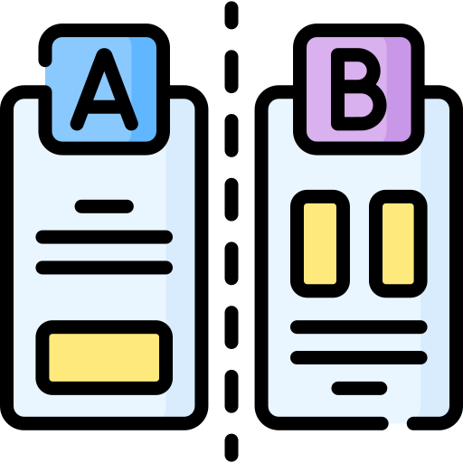
A/B Testing
A/B testing allows you to compare different versions of your design elements (e.g., button placements, layouts) on live users. Changing one thing at a time helps developers identify which design variations perform better on specific devices and user segments. Learn more about A/B testing here.
Suggested Tools
Analysing User Feedback
User feedback, whether qualitative (interviews, observations) or quantitative (surveys, analytics), can be a goldmine of information.
But to truly optimise your website with user centred design, you need to move beyond raw data and translate it into actionable insights. Here’s how:

1. Consolidate & Categorize
Bring all feedback (qualitative & quantitative) together and categorise it by topic, device, or user segment for easier analysis. Segmenting it into different views to focus on different areas helps to identify where you need to do the most work.

2. Identify Patterns & Trends
Look for recurring themes or pain points across different data sets. Focus on issues consistently mentioned by users in qualitative data or through heatmaps to discover which elements may not be working on your webpages.

3. Analyse Quantitative Data
Use website analytics to identify areas where metrics like bounce rate or conversion rate suffer. Do certain pages perform significantly worse? These metrics can reveal potential problem areas in your user based design that need further investigation.

4. Prioritise User Needs
Ultimately, the goal is to prioritize user needs based on the feedback you’ve collected. Consider the severity, frequency, and user experience impact when prioritising improvements for your website design.
By effectively analysing and interpreting user feedback through these methods and tools, you can transform raw data into actionable insights that help you achieve a more user based design.
Strategise and Implement Changes

After gathering and analysing user data, it’s time to implement them into your user centered design.
Transforming user feedback into a clear roadmap for improvement requires strategic planning and collaboration between development and design teams. Here’s how to approach it:

1. Prioritise Improvements
Based on your user feedback analysis, prioritise the areas that will have the most significant impact on user experience across different devices.
Consider factors like the severity of the issue, the frequency of occurrence and the potential impact on user conversion or engagement. From there, you can see which areas to work on first.

2. Create a Responsive Design Roadmap
Develop a clear roadmap outlining the specific actions needed to address the prioritised issues. This roadmap should include timelines, resource allocation, and ownership for each task.
Consider using project management tools like Trello or Asana to visually represent your design improvement roadmap and track progress.

3. Iterative Design and Development
Embrace a continuous approach to your process. Make small changes based on user feedback, conduct follow-up testing to validate the effectiveness of the changes and continuously gather new feedback to inform further improvements.
This process ensures your responsive design continuously evolves to meet user needs and expectations across all devices.

4. Establish a Culture of User Feedback
Embed user feedback into your website development lifecycle. Regularly conduct user testing sessions, test out different design variations with A/B testing and leverage website analytics to monitor user behaviour.
Integrating user feedback throughout the process ensures your responsive design remains optimised and delivers a consistently positive user experience.
Make User Centered Design A Priority

Prioritising user feedback throughout the website design and development process is essential for the user centered design approach. After all, with so many websites competing for user attention, platforms that are not ready to meet user’s needs are doomed to fail.
By following the strategies outlined in this guide, you can gather valuable user insights, translate them into actionable steps and continuously optimise your website to meet the ever-evolving needs of your users across all devices.
Need a hand identifying your website’s pain points and areas for improvement?
Talk to a professional UIUX expert from Flow Digital today for a consultation. Our professional team can assist you throughout your website revamp journey, whether it’s through a website revamp or a full website development journey.