
There is no doubt that media and technology has played a key role in the attention span of digital-savvy people in this day and age.
A study shows that users spend about 47 seconds on any screen before their attention is taken elsewhere.
That’s only 47 seconds to ensure your users are interested in your website!
Nowadays, attention-catching content includes engaging media, which makes digital media optimisation key to a website’s smoothness and positive user experience.
While images, videos and other multimedia elements can enhance visual appeal and engagement they can often be large in size and cause your website to load slowly.
By properly optimising your media assets, you’re one step closer to:
- Speeding up your website loading speed
- Properly adapting your media to different screen sizes
- Delivering a high quality user experience to your website visitors
In this article we will provide valuable insights and strategies for balancing visual quality with performance optimisation.
Looking for something specific? Use the table of contents below to skip to the part you need.
Table of Contents
The Role of Media in Websites
First of all, let’s recap why media is so important in today’s internet landscape.
Media elements have become more than just mere decoration; they are powerful tools for storytelling, conveying information and creating user engagement.
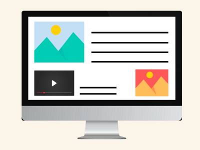
Captivating images, immersive videos and interactive elements enhances your website’s visual appeal and breaks down text-heavy content.
They trigger emotional responses, boost information retention and create memorable user experience.
However, the more complicated the media the more it will impact your website’s performance.
Large file sizes lead to slow loading times, frustrating users and causing them to abandon ship, which in turn causes your websites to be affected negatively by SEO.
That’s why optimising media is so important – it strikes a balance between media quality and website performance while putting user experience at the front.
Let’s explore some of the key techniques for digital media optimisation.
Optimising Images in Responsive Web Design
Images are the most common media elements for websites (which is why we have a whole sub-header for it).
They can be used to convey information, set the mood, split up large texts and enhance user engagement.
But unoptimised images can quickly weigh down your website, creating a frustrating experience for users.
Here are some techniques to optimise images in responsive web design:
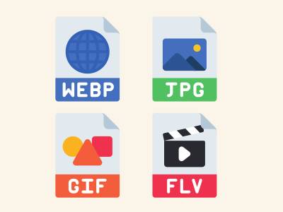
Choose the Right Image Format
- JPEG: Ideal for photographs with complex colour variations, but often produces larger file sizes.
- PNG: Offers lossless compression for images with sharp edges and text, but larger than JPEGs.
- WebP: A newer format offering superior compression with high quality, but browser support might not be universal.
- AVIF: Offers better compression than WebP, but currently has limited browser support.

Resizing and Compressing Images
- Resize images to their intended display size
Your image should be at the dimensions you intend users to view it on specific devices. - Use lossless compression tools
Reduce file size without sacrificing quality with online tools or plugins such as TingPNG, ImageOptim or FileOptimizer - Consider progressive JPEGs
Provide a low-resolution preview that gradually sharpens as it loads, offering a perceived speed boost.

Responsive Image Loading
- Utilise the <picture> element
Specify multiple image sources with different sizes and formats, letting the browser choose the optimal one for each device. - Implement srcset and sizes attributes
Define which image source to use based on screen size and resolution. - Use Flexible Image Elements
Specify the size of your images as percentages depending on which device is accessing your web-page. Read more here.

Utilise Image Placeholders
- Preload image placeholders
Show low-resolution placeholders while high-quality images load in the background, improving perceived loading speed. - Lazy loading images below the fold
Delay loading non-critical images until users scroll down, further optimising initial page load.
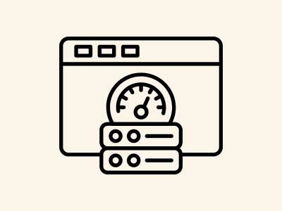
Image Caching
- Set appropriate cache-control headers
Instruct browsers to store images locally, minimising subsequent server requests. - Leverage a Content Delivery Network (CDN)
Distribute images across geographically dispersed servers, reducing latency and improving global delivery speeds.
There is no one single way to optimise images, as there are different sizes and dimensions to keep in mind.
Combine and experiment with different formats, compression tools and loading techniques to find the sweet spot for your specific needs and audience.
Optimising Video and Multimedia Content
Videos and other multimedia content go one step further to bring your website to life, making use of engaging visuals and elements.
However, these elements often come with hefty file sizes, which could affect website performance and user experience.
Ensure you’re optimising rich media with the techniques below:

Video
- Format Selection
Opt for widely supported formats like MP4 with H.264 codec. Balance quality and size by experimenting with bitrates and resolutions. - Codecs & Encoders
Utilise modern codecs like H.264 or VP9 and explore advanced encoding tools. - Responsive Players
Embed videos using responsive players that adapt to different screen sizes and devices
- Format Selection
Opt for widely supported formats like MP4 with H.264 codec. Balance quality and size by experimenting with bitrates and resolutions. - Codecs & Encoders
Utilise modern codecs like H.264 or VP9 and explore advanced encoding tools - Responsive Players
Embed videos using responsive players that adapt to different screen sizes and devices - Lazy Loading
Delay non-critical videos below the fold, prioritising initial page load speed. - Content Delivery Networks (CDNs)
Distribute video content across geographically dispersed servers, minimising latency and optimising global delivery speeds. - Alternative Formats
Explore animated GIFs or WebM for shorter clips - Accessibility
Provide captions/transcripts for inclusivity and alt text descriptions for screen readers and search engines.
- Lazy Loading
Delay non-critical videos below the fold, prioritising initial page load speed. - Content Delivery Networks (CDNs)
Distribute video content across geographically dispersed servers, minimising latency and optimising global delivery speeds. - Alternative Formats
Explore animated GIFs or WebM for shorter clips - Accessibility
Provide captions/transcripts for inclusivity and alt text descriptions for screen readers and search engines.

Infographics
Treat these as large images, focusing on format choice (considering WebP for transparency), compression and responsive delivery using <picture> element and srcset/sizes attributes.

Animations
- Lightweight Formats
Utilise animated GIFs for smaller file sizes. Explore WebM for more complex animations. - Code & Script Optimisation
Ensure efficient code and scripts, implement lazy loading where applicable and prioritise smooth responsiveness across devices.

Interactive Elements
These are often custom features that are added to your site for customers to engage with.
Optimise code and scripts for efficiency, implement lazy loading where applicable and ensure smooth and responsive behaviour across devices.

Social Media Embeds
Utilise official embed options from platforms like Twitter, Instagram, and YouTube to ensure proper responsiveness and avoid unnecessary code.

Audio Files
Choose appropriate formats (MP3, Ogg Vorbis), optimise bitrates for quality/size balance, and utilise lazy loading and strategic placement like videos.
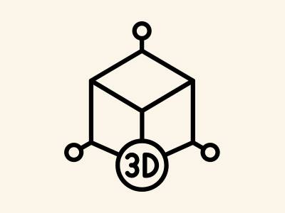
3D Models
If using, explore lightweight formats like glTF or Draco, leverage CDN delivery, and consider alternative representations like 2D images or videos for less powerful devices.
Conducting Performance Testing

Throughout the article, we have highlighted the need to optimise media for better user experience, SEO and mobile friendliness of your website or digital platform.
If your website is particularly focused on visuals and engaging experiences, it’s best practice to do regular checks into your website’s base performance.
Tools for Performance Testing

- Google PageSpeed Insights
This free tool from Google analyses your website’s performance and provides actionable recommendations for improvement, including specific suggestions for optimising media like images, videos, and other elements. - GTmetrix
Another popular tool offering detailed performance analysis, including waterfall charts that visualise how long each element takes to load.
- WebPageTest
Capture real-world performance data from different locations around the globe, providing insights into how your website performs for users in various regions. - Browser Developer Tools
Built-in developer tools in browsers like Chrome and Firefox offer network analysis features, allowing you to inspect individual element load times and identify bottlenecks.
Performance Testing Best Practices

- Test on Different Devices and Browsers
Ensure your website delivers media optimally across various devices and browsers to cater to a diverse user base. - Focus on Real-World Scenarios
Test under realistic conditions, simulating different network speeds and connection types to understand user experience on varying bandwidths.
- Monitor Performance Over Time
Regularly conduct performance tests to track improvements and identify potential regressions as your website evolves. - Prioritise Critical Media
Focus your optimisation efforts on media elements that have the most significant impact on perceived performance, such as above-the-fold content.
Optimising Based on Results
Once you’ve identified areas for improvement through testing, utilise the various digital media optimisation techniques we’ve covered, such as:
- Lazy loading non-critical media
- Resizing and compressing images
- Choosing efficient video formats and codecs
- Leveraging Content Delivery Networks (CDNs)
- Implementing responsive image loading techniques
Performance testing is a continuous and ongoing process.
By regularly assessing your website’s performance and continuously optimising your media, you can ensure a fast, responsive and engaging user experience across all devices and network conditions.

Summary
Remember when we said a user’s attention span on a screen only lasts 47 seconds?
Even with the most engaging content and media, your website is less likely to retain users if your content doesn’t load within that time.
That’s why optimising media elements is so crucial to keep your website performing smoothly and quickly to give your users what they want to see.
Balancing media aesthetics and website speed is an ongoing process.
By following these guidelines and experimenting with different techniques, your responsive website will be equipped with high-performing media that engages users to explore more of your website and drives more traffic to your goals.
Optimise Your Website with Flow Digital
Flow Digital specialises in UI UX design services in Malaysia, helping our clients achieve the best out of their digital platforms.
Whether you’re looking into creating a new website or looking to enhance your current platform, our team of experts will help you through the user experience design process (including digital media optimisation) to achieve the best results for your goals.

Contact Flow Digital today for a free consultation and let’s start crafting your digital masterpiece!