When looking for information on the fly, what is the first thing you do?
You wouldn’t boot up your computer just for a quick Google search – you’d go straight for your mobile phone.
If your website isn’t ready to serve the needs of mobile phone users, you’re risking losing traffic due to poor user experience. After all, over 58% of global website traffic comes from mobile phones.

That’s why adopting responsive web design practices helps ensure your website adapts to different screen sizes, no matter where it’s being accessed.
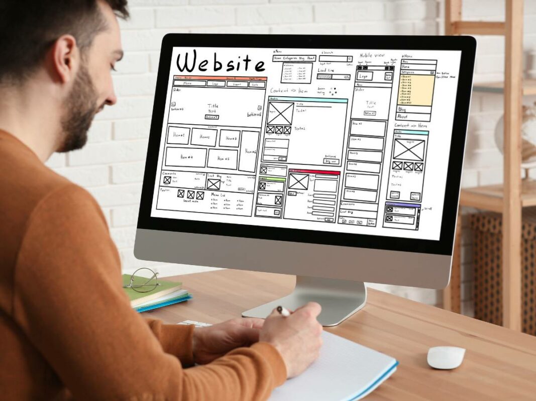
In this article, we will break down responsive layouts, key design principles and best practices to that will leave a strong impression to your users regardless of device.
We will cover the following topics and techniques:
Table of Contents
Take note, throughout the article we will be using responsive web design and responsive web development interchangeably, but they will refer to the same thing.
The Importance of Responsive Web Design
In the multi-device digital landscape of today, anyone can access a website with a mobile phone, tablet, desktop or any smart device with a screen.
Responsive web development and design offers a solution – one design that serves various devices.
This streamlined approach is not only cost-effective but also time-efficient.
After all, you wouldn’t want to be stuck designing multiple web designs for each individual screen size.

Responsive design plays a key role in improving user interaction and driving conversions.
The reason is simple: users prefer websites that offer seamless browsing across all devices.
If a site’s design responds and adapts to their device’s screen size, users are more likely to engage with the content and less likely to leave.
This could lead to a decrease in bounce rates and a increase in conversion rates.
Simply put, responsive web design should be more than just a tool to make your website look good.
It’s a strategy to optimise your site for performance, usability and overall user experience that will contribute to your business’s digital success.
Responsive Web Design Principles
There are five essential responsive web design principles that are key to a responsive website:
- Fluid grids and flexible images
- Media queries
- Responsive typography
- User navigation
- Continuous testing
These five principles work together to create a web design framework that adjusts fluidly to the device it is viewed on, ensuring optimal user experience.
Let’s look deeper into each of these fundamental components in the sections that follow.
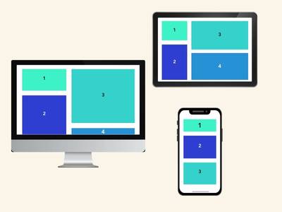
Embracing Fluid Grids and Flexible Images
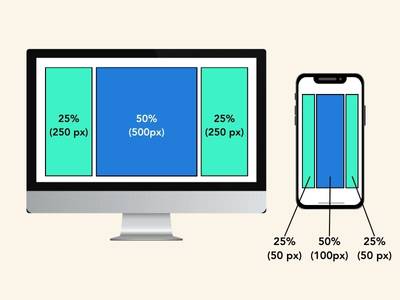
Fluid grids and flexible images is one of the basics of responsive web development.
The fluid grid method uses percentages to define widths that can adjust with varying screen sizes instead of fixed dimensions.
This method helps your responsive layout to maintain its proportion and balance, no matter on which device it’s being accessed on.
Flexible images function the same way. Images must retain their aspect ratio without distortion or becoming cropped on different devices.
By using percentages with max-width property, images have the flexibility to scale down for certain devices but prevents from going past the original dimensions.
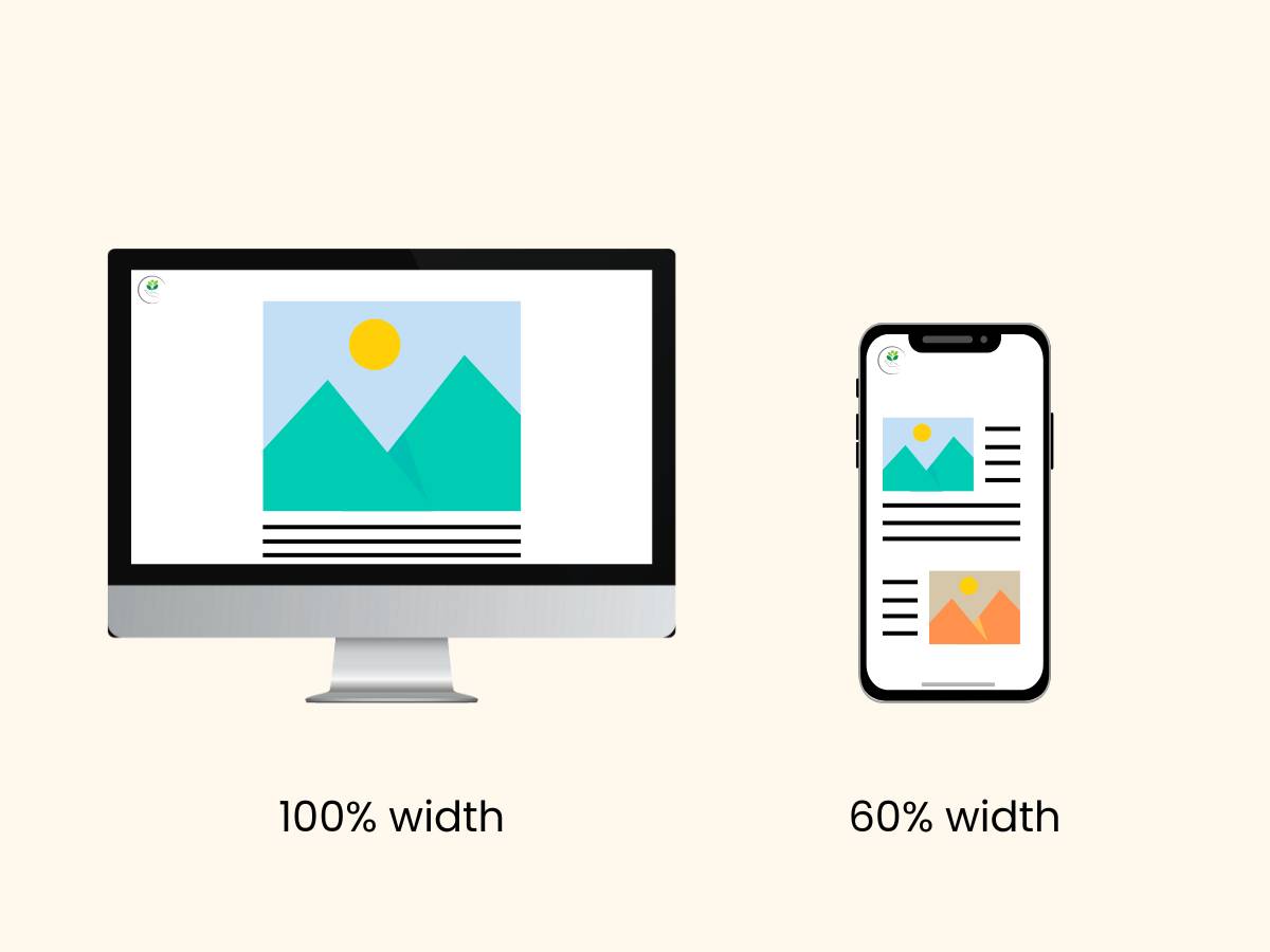
For example – you may set your image to be at 100% width for desktops, but for a mobile device you may decide to scale it down to 60% instead.
In summary, these two practices work together to adapt web designs across different screen sizes and resolutions.
While fluid grids manage the integrity of the responsive layout, flexible images ensure that your visual media remains undistorted.
Both of these principles work together to create a harmonious visual user experience across your website.
Media Queries: Tailoring Styles for Different Devices
Media queries act as the magical wand that brings adaptability to responsive design and cross device compatibility for your media content.
It essentially goes one step further than flexible layouts and images would.

Media queries use CSS (Cascading Style Sheets) to apply different styles to a webpage based on conditions such as screen width, height, resolution or device orientation.
These conditions are specified using media features and when a feature matches the device’s characteristics, the associated styles are applied.
For example, you might have a media query that says:
“If the screen width is less than 600 pixels, apply these styles.”
This could involve adjusting font size, rearranging elements or hiding certain content to ensure optimal display on smaller screens like smartphones.
However, using media queries is not just about shrinking or enlarging content to fit different screens.
It’s reimagining how your content can be most effectively presented on each device, with readability, navigation and interaction factors in mind.
This process might involve rearranging elements, changing font sizes, or even hiding certain content on smaller devices.
A tailored viewing experience for every device is essentially what media queries provide, but can be slightly more technical to apply.
Speak to your developer or get in touch with us if you’re looking for more technical web development adjustments.
Responsive Typography: Ensuring Readability on All Screens
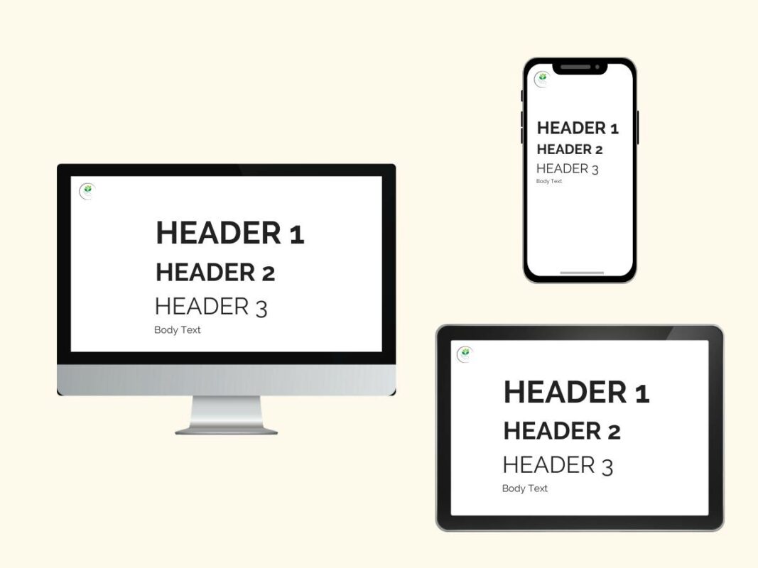
Responsive typography maintains the readability and visual hierarchy of your text content.
Using units like ‘em’ or ‘rem’ helps to define scalable font sizes.
This is especially important for small screen sizes – imagine oversized text taking over a small smartphone and extending your website length.
It’s also worth noting that line-height can also improve readability on such devices.

Size, weight and colour of typefaces should be taken into account.
Headlines should be distinguishable, subtitles should be clear and body text should be readable, each complementing one another.
So, when you embark on your journey towards a more responsive website, don’t forget to give typography the attention it deserves.
Navigation in Responsive Design: Intuitive Menus for Every Screen
Navigation and menu design should guide where you want users to go.
Different devices come with varying screen real estate, which requires the need for a fluid and adaptable approach to navigation design.
Menus need to be as flexible as the rest of your layout, adapting in accordance with the available space.
Keep these key concepts in mind:
Laptops/Desktops
Horizontal menus work well in most desktop and laptop screen sizes
Mobile
When designing for mobile responsiveness a dropdown menu or hamburger menu usually works best
Tablets
Medium size screens such as tablets can have a combination of both
But remember, it’s not only about fitting into smaller spaces.
Even as your menu condenses or repositions itself, it must remain intuitive and user-friendly.
Your users should be able to navigate your site with ease through understandable visual hierarchy, regardless of device.
Over time, you should also be continuously testing your navigation flow to ensure smoothness. You can even ask your users for feedback and suggestions.
Read more about intuitive website navigation here.
Testing and Iterative Improvement
No website was ever built perfectly from the beginning.
Unearthing glitches or user experience hitches is an integral part of the responsive web development process.

A key element to this is gathering and incorporating feedback from your audience.
Their feedback can provide insights into improvements on how to enhance your website for other users.
It’s also important to remember that the digital landscape is constantly evolving, and your website should be able to adapt with the times.
Responsive design is not a static process; it thrives on constant evolution and improvement.
So, make sure to stay in tune with user feedback and embrace the iterative nature of the responsive design process to create a more user-centred design.
Stay on top of Website Responsiveness with Flow Digital
Ultimately, responsive web development and design goes beyond a trend; it represents a fundamental principle of current web design.
To recap, a successful responsive website should:
- Adopt flexible layouts and images
- Use media queries to adapt layouts to specific devices
- Adopt responsive typography
- Navigation menu must be intuitively accessible
- Utilise user feedback for continuous improvements

What’s more, as new technologies and techniques are constantly appearing, there is always a need for website to stay on top of the latest website trends.
By staying on top of your responsive website design, you evolve alongside your user’s needs in a constantly changing digital landscape.
Need a responsive website for your business? Check out our UI UX design services to get started!