
Going into 2024 after the introduction of AI and Machine Learning reignites the challenge for all digital marketers to stay ahead and relevant. After all, there is no doubt that with the introduction of new tech like ChatGPT and Midjourney, staying on trend with developments is crucial to stay relevant.
The same goes for ensuring your website continues to capture the attention (and clicks) of your audiences. This boils down to one main concept: creating the best user experience.
In today’s dynamic digital landscape, responsive web design stands as a key for compelling and user-centric online experiences. As users seamlessly transition between devices, the ability of a website to deliver a consistent and intuitive experience is not just advantageous but imperative.
Join us as we go into the best practices of responsive web designs that transcend device boundaries, fostering an environment where users can effortlessly interact with content, products and services.
Table of Contents
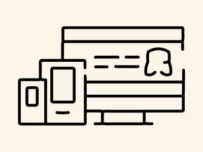
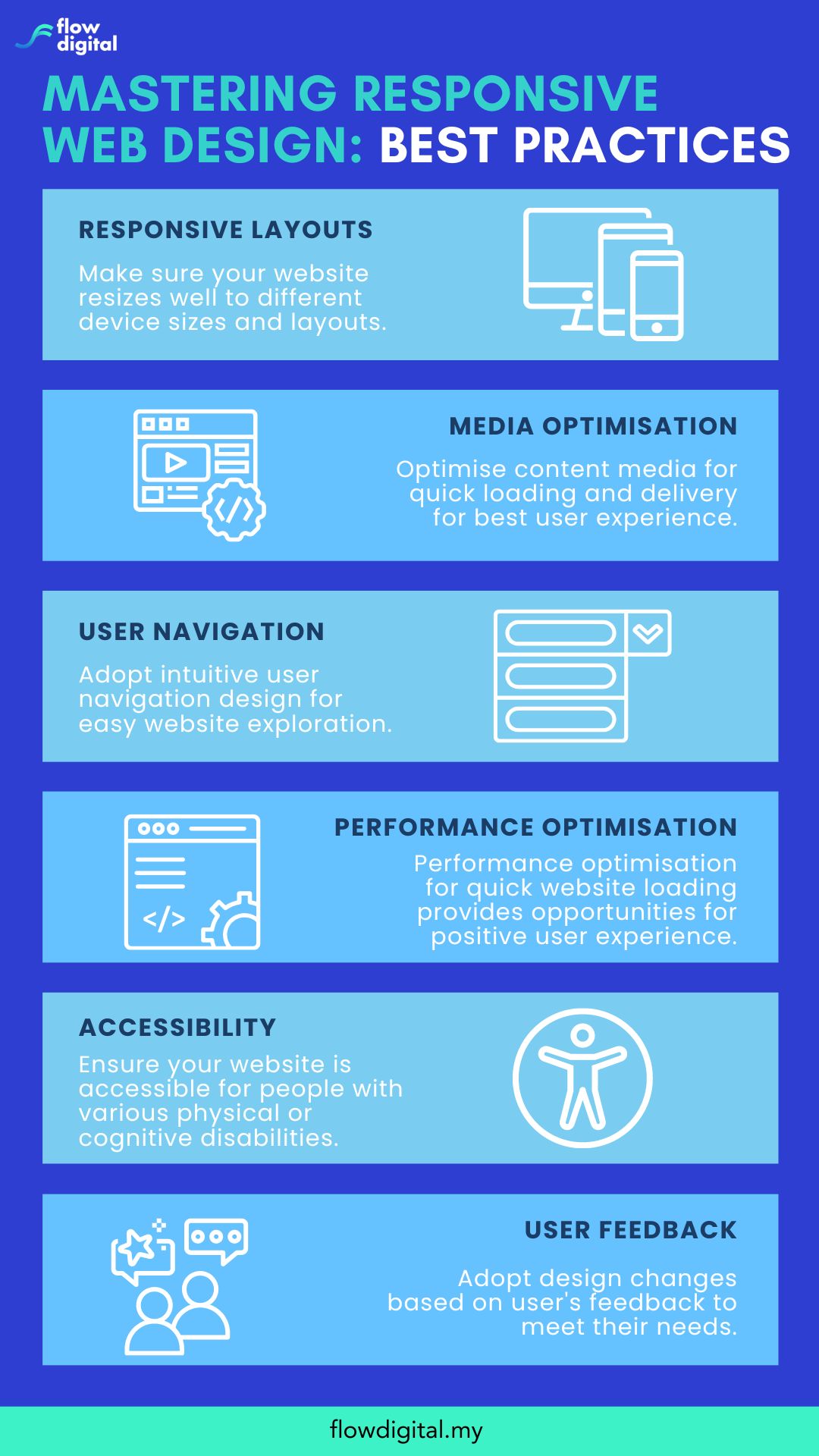
Fundamentals of Responsive Web Design

Responsive web design is not merely a trend but a strategic approach to meet the demands of a diverse digital audience.
Simply put, it involves crafting websites that dynamically adapt to different screen sizes and devices.
Adaptability ensures that users receive an optimal viewing and interaction experience, regardless of whether they are accessing a site from a desktop, tablet or smartphone.
Imagine it as the art of creating flexible, fluid layouts and designs that cross through different devices.
Importance of Cross-Device Compatibility in the Digital Era

The digital era is characterised by how many devices are available for users to interact with your website.
Desktops, laptops, smartphones, tablets – the list becomes infinitely larger when considering each individual brand of devices, each with their own unique sizes.
Users seamlessly transition between gadgets throughout their daily lives, expecting a consistent and intuitive experience.
Responsive web design ensures that your website is not confined to a specific device but thrives across various platforms. This adaptability is not just about convenience, but necessary in a world where user attention is fleeting and competition for engagement is fierce.
That’s why ensuring that your platform is consistent across all platforms (or at least those that matter to you) are optimised.
Long story short – your website needs to be able to adapt to the number of different devices your target audience will interact with your business for a seamless user experience.
That is key to keeping them interested.
Creating User-Friendly Experiences Across Devices

User centric design is subjective to your website style, features and industry. After all, there are as many websites as there are businesses in the world.
But there are a few common concepts that are at the core of user experience design for all web platforms:
- Responsive Layouts
- Media Optimisation
- User Navigation
Understanding Responsive Layouts
Responsive layout design is an art that harmonises aesthetics with functionality.
At its essence, a responsive layout ensures your website not only looks visually appealing but functions well regardless of whether it’s viewed on a desktop, tablet, or smartphone.
The fundamental principles of responsive layouts revolve around flexibility and adaptability. Unlike traditional fixed layouts, responsive layouts employ a fluid grid system.
This system allows the elements within a webpage to proportionally adjust based on the screen size, providing a consistent user experience on any device.
Strategies for Creating Visually Appealing and Functional Layouts
Crafting a responsive layout involves strategic decisions that balance aesthetics and functionality. Here are a few key strategies for creating layouts that respond to diverse devices:
1. Fluid Grids
Utilise relative units like percentages for widths instead of fixed units like pixels.
This allows your layout to adapt proportionally to different screen sizes.
2. Flexible Images

Implement CSS rules to ensure that images resize proportionally with the screen.
This prevents images from overflowing or becoming too small on various devices.
3. Media Queries

Employ media queries to apply different styles based on the characteristics of the device, such as screen width.
This enables targeted adjustments for optimal viewing.
4. Mobile-First Approach

Start designing for mobile devices first, then progressively enhance the layout for larger screens.
This ensures a solid foundation for a diverse range of devices.
Understanding and implementing these strategies contribute to the creation of visually appealing and functional responsive layouts.
These layouts not only enhance user satisfaction but also positively impact factors such as SEO and user engagement.
For a more comprehensive look into these strategies, check out our article:
5 Best Practices for Responsive Web Design.
Optimising Media for Different Devices

In the digital landscape where attention spans are limited and visual appeal is paramount, rich content is the first deciding factor that will affect user’s first impressions of your brand.
Whether it’s captivating images, compelling videos, or other types of content, optimising media is integral to delivering an engaging user experience. But at the same time, you wouldn’t want an overwhelming amount of content flooding your website.
Finding the right balance and techniques to optimise for web load speed and attractiveness will ultimately affect your overall user experience and conversion rates.
Ensure you’re employing these media optimisation techniques in your website:

1. Responsive Images
Implement the use of responsive image tags and CSS to ensure that images scale appropriately based on the device’s screen size.
This prevents images from appearing too large or too small, maintaining a visually appealing layout.
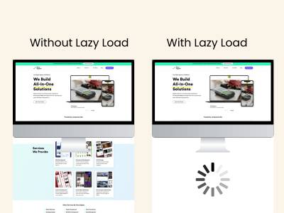
2. Lazy Loading
Employ lazy loading techniques to defer the loading of images and videos until they come into the user’s screen.
This improves page load times and also conserves bandwidth, especially beneficial for users on slower connections.
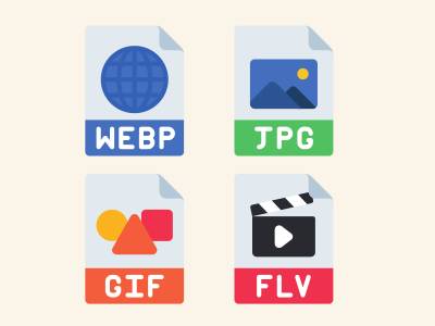
3. Optimised File Formats
Choose appropriate file formats for different types of media.
For example, use modern image formats like WebP that provide high quality at smaller file sizes, enhancing both speed and quality.
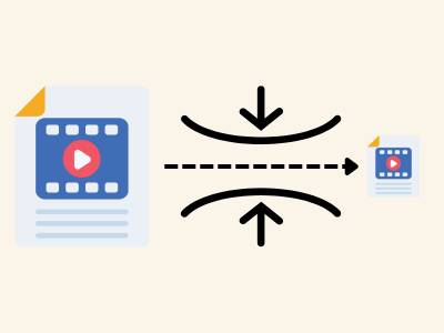
4. Video Compression
Compress videos without compromising quality to reduce file sizes.
This ensures smooth playback on various devices while minimising the impact on page loading times.
Learn more about the different types of media optimisation and optimisation techniques you need to know to keep your website running smoothly by clicking below:
User Navigation in Responsive Design

When it comes to web design, user navigation usually refers to the structure of a website and how easy it is for users to comprehend how to get to where they want.
In essence, good user navigation must be intuitive.
This means that new users should be able to understand how to explore your website when they first explore it. This means a number of things when designing your website:
- Establish a clear hierarchy for navigation elements. This includes navigation menus which are structured clearly and labelled accurately for each page it leads to.
- Mobile design is even more important when it comes to navigation as the size of your website will be much more different. Make sure your navigation system can be adapted to a smartphone, or come up with a more comprehensive solution.
- Maintain your branding. Ensure your website design, logos and colour schemes are consistent across all pages so users are aware that they are still on your website.

By adapting these responsive web design techniques into your platform from the get-go, you create a consistent user-friendly experience for your users.
This in turn leads to more people visiting your site, and hopefully to become customers.
Keep in mind, if you’re setting your website up for the first time or have just undergone a revamp, the responsive design work doesn’t end there.
As your website grows and adapts to new changes, you have to keep up with the updates and continuously improve your design along with it.
To learn more check out our article:
5 Intuitive Website Navigation Elements
Next we will explore a few key areas that you have to make sure you’re regularly updating to keep on top of your website’s responsiveness.
Strategies for Continuous Improvement
In the fast-paced digital landscape, stagnation is the enemy of progress. The key to an outstanding and enduring user experience lies in the commitment to constant refinement and adaptation.
With so many competitors vying for your target audience’s attention, it is imperative that you constantly be on the lookout on ways to improve your website. Here are some areas which you can consider:
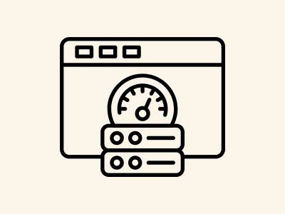
Performance Optimisation
Performance optimisation is not merely a technical concern; it directly impacts user satisfaction, engagement and even search engine rankings. By adopting best practices in this area, you not only enhance the functionality of your site but also contribute to its overall success.
When talking about performance optimisation, you should be thinking about ways to optimise for website speed loading. In these cases, it’s best to work with a developer to ensure the site runs smoothly.

1. Efficient Coding Practices
Streamline your codebase to eliminate redundancies and reduce file sizes.
This not only enhances website speed but also facilitates easier maintenance.

2. Image Compression
Employ techniques such as lossless image compression to reduce file sizes without compromising visual quality.
This is particularly crucial for ensuring swift loading times across devices.

3. Minimise HTTP Requests
Limit the number of HTTP requests by consolidating files, reducing the time it takes for a browser to fetch necessary resources.
4. Browser Caching
Leverage browser caching to store static files on a user’s device.
This enables faster load times upon subsequent visits, contributing to a smoother user experience.

5. Content Delivery Networks (CDNs)
Utilise CDNs to distribute your website’s static content across multiple servers worldwide.
This reduces latency and accelerates content delivery.
How To Speed Up Your Website – 5 Key Areas
Accessibility in Responsive Design
Besides speed and efficiency, a crucial pillar of responsive web design lies in inclusivity.
Designing a website with accessibility in mind is crucial to ensure that all users, regardless of abilities or disabilities, can access and navigate your content. Website accessibility includes a few key factors to consider in the design:
1. Keyboard Accessibility
Ensure that all interactive elements and functionalities are operable using a keyboard. Users with motor disabilities or those who cannot use a mouse rely on keyboard navigation.
2. Colour Contrast
Maintain sufficient contrast between text, buttons and background colours.
This benefits users with visual impairments or colour blindness and enhances readability.
3. Responsive Typography
Use scalable and legible fonts to accommodate users who may need to adjust text size.
Responsive typography ensures readability across various devices and screen sizes.
4. Alt Text for Images
Provide descriptive alternative text (alt text) for images.
This helps users with visual impairments understand the content conveyed by visuals.
5. Captioned Multimedia
Include captions or transcripts for multimedia content such as videos and audio.
This benefits users with hearing impairments and ensures a comprehensive experience.
Integrating accessibility into your inclusive web design contributes to a more open online experience for all users.
Regular testing and ongoing efforts to stay informed about accessibility best practices are essential to maintaining a high standard of inclusivity.
User Feedback and Iterative Improvement
Successful user experience design should rely on user feedback and the iterative refinement of your digital space. There is no perfect website from the get-go!
By aligning with your audience’s opinions, you’re ensuring you reach the best possible user experience for your website visitors.
Here are a few key ways you can adopt user feedback practices into your website:

1. Identifying Pain Points
User feedback serves as a valuable tool for identifying pain points and areas of friction within your website. Understanding where users encounter difficulties enables targeted improvements to enhance overall usability.
Regular A/B testing can help you to identify these problems and ways to improve them.

2. Adapting to Changing Trends
The digital landscape evolves rapidly, and so do user expectations.
Regular feedback loops allow you to adapt your design to changing trends, ensuring that your website remains relevant and appealing.

3. Usability Testing
Conduct regular usability testing with real users to observe their interactions with your website.
Identify areas of confusion, navigation challenges, or potential enhancements to the user interface.

4. Utilising Analytics Data
Leverage analytics tools to track user behaviour, page performance, and engagement metrics.
Analysing data provides quantitative insights into user interactions and helps identify areas for improvement.
Understanding the full grasp of user feedback and insights gives you the advantage of knowing where to improve your platform. Responsive web design should be responsive to user’s after all.
How to Apply User Centred Design into Websites
Recapping Responsive Design Best Practices
In our exploration of responsive web design and their best practices, we’ve looked into fundamental principles that form the bedrock of a compelling and user-centric digital experience.
These principles collectively contribute to the mastery of creating seamless user experiences across devices as well users that are visiting your website.
As a quick recap:
- Make sure your website resizes well to different device sizes and layouts.
- Optimise content media for quick loading and delivery for best user experience.
- Adopt intuitive user navigation design for easy website exploration.
- Performance optimisation for quick website loading provides opportunities for positive user experience.
- Ensure your website is accessible for people with various disabilities.
- Adopt design changes based on user’s feedback to meet their needs.
Get A Fully Responsive Website with Flow Digital
Sometimes, you need a professional UI/UX designer to ensure that every aspect of your website is at its best when targeting your audience.
Set yourself up for success with Flow Digital’s web design and development experts.
Our team is ready to help bring your brand to the next level, whether through a website revamp or building a fresh new website from scratch.
Check out our UI/UX services to get started now.