
Just a few years ago, you probably wouldn’t have imagined how much the world has shifted digitally in such a short span of time.
In an era where technology expands exponentially, what was once in trend a dozen months ago can be considered soon to be obsolete. Building a responsive website is no exception.
The world of websites is like the fashion industry; trends are constantly evolving, and what’s hot today might be out of style tomorrow. Just like a fashion designer wouldn’t create a one-size-fits-all outfit for every occasion, websites need to adapt to their audience, their situation and the emerging website trends.
In this article, we will be exploring the key website design trends in 2024 to look out for and a few tips into how to apply them to your digital platform.
Here’s what we will cover:
Table of Contents
The Current State of Web Design

While trends in the website design world are constantly changing, there are a few core principles that remain essential for creating websites that must follow user design principles across all devices and platforms.
Core Principles of Web Design
Websites are no longer static platforms for information; they are interactive platforms that should cater to the needs and expectations of their users.
User centered design is a philosophy that places the user at the forefront of the design process and it stands at the pillar of how websites have to be in order to experience success. These include:
- User Research: Research users to understand their needs and inform design decisions.
- Information Architecture: Organise content logically for easy navigation.
- Usability Testing: Test with real users to identify and address usability issues.

Current UX trends in websites also indicate that users have a more positive experience towards more high quality, visually appealing websites that are intuitive and easy to navigate.
Consider adding these web design trends to make your platform more friendly:
- Minimalist Design: Clean layouts with a focus on white space and negative space are becoming increasingly popular. This approach prioritises user experience (UX) by ensuring content is clear, concise, and easy to navigate on any device.
- Microinteractions: Subtle animations and interactive elements can enhance user engagement and provide feedback on user actions. These microinteractions can be anything from a button that changes colour on hover to an animation that confirms a form submission.
- High-Quality Visuals: High-resolution images, videos, and other visual elements are becoming even more crucial for capturing user attention and creating a positive first impression. Responsive design ensures these visuals are displayed flawlessly on all devices.
Next, we will be looking into more specific areas of web design trends that can have a bigger impact on how your website and platforms need to be adjusted.
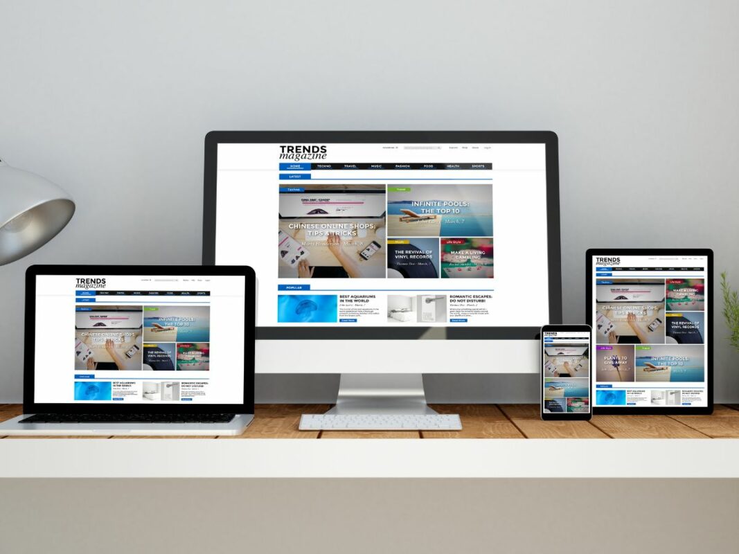
Responsive Design for Emerging Devices
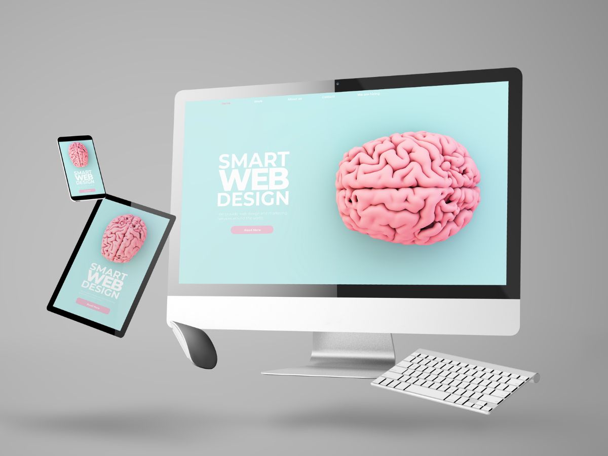
The world of technology is constantly introducing new devices and screens that users access websites from. Responsive design needs to adapt to accommodate these innovations and ensure a seamless user experience (UX) across all platforms.
Beyond traditional desktops, laptops and smartphones, a wave of new devices is impacting how users interact with the web.
Here are a few examples:

Foldable Phones
These innovative devices offer a larger screen size when unfolded, blurring the line between smartphones and tablets.
How to Optimise – Adjust layouts to optimise viewing experiences on both the folded and unfolded states. Also, be sure to optimise for touch interaction on a larger screen.

Wearables
Smartwatches and other wearable devices have limited screen space and require a minimalist design approach with clear and concise information display.
How to Optimise – Focus on essential information and functionality as well as intuitive user interaction. Smart watches have limited space after all!

Smart Displays and Voice Assistants
Smart speakers and displays like Google Home and Amazon Echo are becoming increasingly popular.
How to Optimise – Consider voice search and navigation optimisation and use a simplified visual interface such as a card-based design for presenting information.
By understanding the unique needs of these emerging devices and incorporating responsive design strategies accordingly, web designers can create future-proof platforms that cater to a diverse user base and deliver exceptional user experiences no matter where or how users choose to access them.
AI and Automation in Website Design

Unless you’ve been living under a rock in the past year, artificial intelligence has taken the world by storm. In the wake of ChatGPT taking over the world, major tech giants from around the world are scrambling to release their own versions of AI-powered tools and products.
From Google’s Gemini (formally Bard) to Intel’s AI Project Articul8, the power artificial intelligence and automation holds to enhance the workflow in any industry cannot be underestimated.
Web design trends have started to show that more and more web builders are using such tools to assist and inform their design and development decisions. Here’s how:
Personalisation
AI can analyse user data to personalise website layouts and content based on individual preferences and browsing behaviour. This could involve dynamically adjusting layouts to prioritise content most relevant to a specific user type.
A/B Testing Automation
AI can automate A/B testing, allowing designers to experiment with different design variations and quickly identify the most effective versions for specific devices and user segments.
Predictive Content Delivery
With enough data, AI can predict user needs and preferences based on past behaviour, allowing for the pre-loading of content and images most likely to be relevant on a user’s device. This can significantly improve website loading speeds, making it a UX trend worth pursuing to optimise content-centric platforms.
Content Generation
AI writing tools can be used to generate drafts of website content, like product descriptions or blog posts. However, human oversight and editing are still crucial to ensure quality and maintain brand voice.
Code Generation and Error Detection
Some AI tools can assist with code generation by suggesting code snippets and detecting errors. Making use of this will reduce the time it takes to create digital products and solutions.
As AI technology and automation workflows continue to evolve, we can expect even more innovative and out-of-the-box solutions to arise. At its core, most of these tools are designed to appeal to the user design principles that puts user experience first.
So make sure you’re keeping up with this evolving web design trend to stay relevant!
Integrating AR and VR into Responsive Web Experiences

The boundaries between the physical and digital worlds are blurring. Augmented Reality (AR) and Virtual Reality (VR) technologies are rapidly evolving, offering exciting possibilities for web design.
Although having been around for a while, AR and VR are still extremely relevant technologies in the current digital landscape as they are excellent channels for enhancing user experience.
Here’s how to distinguish the two:
- AR overlays digital elements onto the real world, viewed through a smartphone or smart glasses.
- VR creates a completely immersive experience within a simulated environment, typically accessed through a headset.
Examples of AR Integration

- IKEA’s Place App uses AR to help people plan and visualise their catalogue of furniture products in their home, taking the ‘try before you buy’ concept beyond the showroom.
- L’Oreal’s app allows customers to try on makeup through their smartphone camera and visualise what they look like before a purchase.
- BMW provides customers with a customisation and visualisation feature with their AR app, allowing them to see what their preferred vehicle looks like in their homes.
Examples of VR Integration

- Nike created an immersive metaverse experience to attract young customers and interact with their brand.
- NASA uses VR technology to operate robotic arms and space vehicles using haptic feedback and simulated touch.
- ClassVR provides educators with virtual field trips and tours for their students to experience different key areas of interest around the world through VR headsets.
Strategies and Tips to Integrate AR/VR
Integrating AR and VR is highly dependent on the nature of your platform and what you’re trying to achieve with this technology. Keep these strategies in mind if you do:
- Progressive Enhancement: Start with a basic responsive website and then progressively enhance the experience with AR/VR features for compatible devices.
- WebXR: Utilise WebXR, an open standard API for web-based AR and VR experiences, for broader compatibility across devices.
- Focus on User Input: Design intuitive ways for users to interact within the AR/VR environment, considering limitations of touchscreens, voice commands, or VR controllers.
- Device Compatibility: Ensure your AR/VR experiences are compatible with a range of devices with varying technical capabilities.
While AR and VR are nice things to have for your website, they can often take a lot of time and resources to develop depending on the scale of what you’re looking for. First ensure that you know what you’re looking for in your platform and whether it’s feasible to integrate one for your business.
Ethical Considerations and User Privacy

In recent years, data breaches and privacy scandals have increased user awareness and concern about how their personal information is collected, used, and potentially misused online.
Responsive websites, by their very nature, often collect a wider range of user data to personalise experiences and optimise content delivery across various devices.
This increases the importance responsive web designers and developers have to prioritise ethical data collection practices and user design principles to create trustworthy web experiences.
Here are some key considerations to keep in mind.
Be Transparent
Transparency on what data is collected, how it is used and with who it is shared with will go a long way. Obtain clear and informed consent from users before collecting any personal data through consent pop-ups.
Inform users on the advantages of providing their data, such as better personalisation for them to find the content/products they like or stay up to date with the latest deals and promotions.
In cases where users do not want to give their data, provide an opt-out solution to ensure they have the freedom of selection. Remember, users like to be in control of their data!
Invest in Data Security
Implement reliable measures to secure user data from misuse and unauthorised access. Protecting your customer’s data is key to keeping their trust in your brand and is now even more important than ever. Here are some data protection techniques you can consider:
- Encrypted Data: Store user data securely, encrypting it both in transit (HTTPS) and at rest (databases). This minimises unauthorised access even in case of a breach.
- Stay Updated: Regularly audit your website’s code and infrastructure for vulnerabilities. Keep software and plugins updated with the latest security patches to close known gaps.
- Validate User Input: Prevent malicious code injection by ensuring user input matches expected formats (e.g., prevent SQL injection or XSS attacks).
- Privacy-Preserving Techniques: Consider using anonymized data or privacy-preserving techniques like differential privacy when analysing user behaviour.
Create An Emergency Response Plan
Data breaches can happen so it’s crucial to have a well-defined incident response plan in place to minimise damage and ensure a swift recovery in case it happens.
This plan should outline a clear course of action for your team in case of a security breach involving user data. Here are some key aspects of an effective incident response plan:

- Detect & Contain: Quickly identify a breach, then isolate affected systems and revoke access to contain the damage.
- Notify Users: Inform affected users transparently about the breach, explaining compromised data and steps they can take.
- Investigate & Fix: Investigate the breach source, fix vulnerabilities to prevent future incidents.
- Report & Document: Report the breach to authorities if required, and document the entire incident response process.
By having a well-defined incident response plan and having the proper preparations, your team will be better prepared to handle a data breach quickly and efficiently.This will help minimise the impact on users and protect your company’s reputation.
Keep Up With Website Trends to Stay Relevant!
In short, the success of trending websites is affected by their responsive design and how well it meets the user’s needs. We live in a digital era where so many platforms are fighting for attention, and only those who can keep up with what catches their target audience’s needs will prevail.
To recap, those who want to implement website design trends in 2024 should consider:
- Adopting responsive design that ensures a seamless user experience across all devices, from desktops to wearables and beyond.
- Creating immersive and interactive web experiences with AR/VR
- Implementing AI into automating tasks, personalising content and optimising website design.
- Building trust with users through transparency in data collection practices and a commitment to strong data protection.
Need some help bringing your website to the next level? Get in touch with Flow Digital’s professional designers and developers today and find out how to add these new website trends into your platform today!