Colour – we are exposed to it all around us and everyday. In the digitised world we live in today, one cannot underestimate the significance of colour. Whether it’s a personal blog, a corporate website, or an e-commerce platform, the choice of colours plays a pivotal role in shaping the experience of the world around us. You could say the very core of user experience starts from the element of colour.
So, how does colour play a role for your website’s design? Read on to embark on our quick masterclass in the world of UI colour, where we will explore the art and science of creating the perfect colour palette for website design.
Understanding Colour Psychology in UI Design
Colour in UI design is not just about aesthetics; it’s a language of its own. It communicates and evokes emotions and feelings. Each colour has a unique psychological impact on users.

For instance, blue often conveys trust and stability, while red can stir up excitement and passion. Understanding these nuances is essential in crafting a compelling user experience.
The Basics of Colour Theory in Website Design
To master the art of creating a mesmerising colour combination for a website, you must first grasp some key concepts of colour theory. These include, hue, saturation and value, which are the building blocks of UI colour palette creation.
Hue
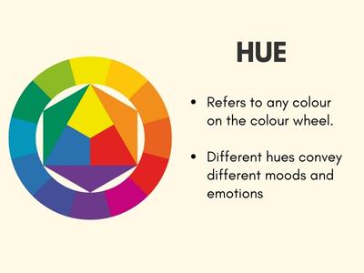
Hue is essentially the colour itself. When we think of primary colours like red, blue, and yellow, we’re thinking of different hues. For example, “red” is a hue, and so is “blue.” In a UI context, the selection of the right hue is often the starting point for crafting a unique visual identity. Different hues can convey different moods and emotions, so choosing the right one is crucial to start aligning your design with your project’s goals.
Hue is essentially the colour itself. When we think of primary colours like red, blue, and yellow, we’re thinking of different hues. For example, “red” is a hue, and so is “blue.” In a UI context, the selection of the right hue is often the starting point for crafting a unique visual identity. Different hues can convey different moods and emotions, so choosing the right one is crucial to start aligning your design with your project’s goals.
Saturation
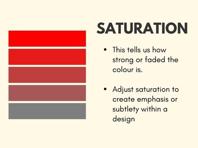
Saturation refers to the intensity or purity of a colour. Highly saturated colours appear vibrant and bold, while desaturated colours are more muted. UI designers often adjust saturation to create emphasis or subtlety within a design. For instance, you might choose a highly saturated red to draw attention to a call-to-action button and a desaturated grey for background elements to make the foreground content pop.
Saturation refers to the intensity or purity of a colour. Highly saturated colours appear vibrant and bold, while desaturated colours are more muted. UI designers often adjust saturation to create emphasis or subtlety within a design. For instance, you might choose a highly saturated red to draw attention to a call-to-action button and a desaturated grey for background elements to make the foreground content pop.
Value
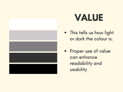
Value pertains to the lightness or darkness of a colour. It’s the attribute that gives a colour depth and contrast. In UI design, proper use of value can enhance readability and usability. For example, text elements should have good contrast with their background to ensure legibility. Properly adjusting the value of text and background colours is essential for an accessible design.
Value pertains to the lightness or darkness of a colour. It’s the attribute that gives a colour depth and contrast. In UI design, proper use of value can enhance readability and usability. For example, text elements should have good contrast with their background to ensure legibility. Properly adjusting the value of text and background colours is essential for an accessible design.
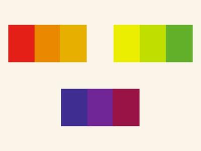
The Colour Wheel

The colour wheel is a designer’s best friend. It consists of primary colours (red, blue, yellow), secondary colours (green, orange, purple), and tertiary colours (the mix of primary and secondary colours).
Understanding the relationships between these colours is crucial in website UI design. It allows designers to create harmonious and visually appealing colour schemes. When creating a brand, specifically look out for complementary, analogous colours and triadic colours.
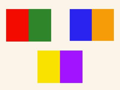
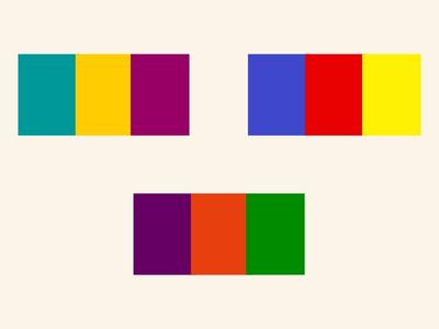
Complementary
Using colours that are opposite each other on the wheel, such as red and green, creates strong contrast and can make certain UI elements stand out. However, it’s essential to balance these colours effectively to prevent visual strain.
Analogous
Choosing neighbouring colours on the wheel, like different shades of blue or green, creates a sense of unity and cohesiveness in your design. This is ideal for creating a calming and balanced user experience.
Triadic
Selecting three colours that are evenly spaced around the wheel, such as red, blue, and yellow, can provide a dynamic and visually appealing colour scheme. It offers both contrast and balance.
Factors to Consider in UI Colour Selection
When choosing a UI colour palette for website design, several factors come into play.


Accessibility and Inclusivity
- Ensure that your design is accessible to all users, including those with disabilities.
- Choose colours and design elements that meet accessibility standards, such as sufficient contrast for text and background.
- Test your design with accessibility tools to identify and rectify any issues.

Brand Identity

- Your colour choices should align with your brand’s identity and values.
- Consistency in colour usage across your digital assets helps in brand recognition.
- Reflect your brand’s personality and mission through your UI design.


Target Audience
- Understand the demographics and preferences of your target audience.
- Consider how your chosen colours and design elements resonate with your users.
- Tailor your UI design to appeal to your specific user base.


Cultural Considerations
- Be aware of cultural differences and associations with colours.
- Certain colours may have different meanings in various cultures.
- Adapt your colour palette to avoid unintended cultural clashes and misinterpretations.
Tools for Crafting the Perfect Colour Palette
Now that you have a grasp of colour theory, it’s time to select the perfect hues. There are many tools and colour palette generators available to make this process easier. Some popular options you can try include:


These tools help you experiment with different colour combinations for your website, until you find the one that resonates with your project.
Common Mistakes in UI Colour Design
Mistakes in UI colour design are common but avoidable. Make sure you’re not making these:
Overuse of Colour
Using too many colours in your UI design can lead to visual chaos and overwhelm the user. Stick to a limited colour palette that compliments your brand and design objectives.
Lack of Contrast
Failing to use contrast between text and background colours can make content hard to read, especially for users with visual impairments.
Clashing Colours
Poorly chosen colour combinations can create visual discomfort for users. Avoid using colours that clash or create a jarring effect.
Not Testing on Different Devices
Colours can appear differently on various devices and screens. Neglecting to test your UI design on a range of resolutions can lead to unexpected colour variations that affect the overall user experience.
Ineffective Use of Colour Psychology
Understanding the psychological impact of colours is essential. Using colours that don’t align with your design’s goals or target audience can lead to missed opportunities to evoke specific emotions or actions.
Ignoring User Feedback
Disregarding user feedback on colour choices and preferences can be a mistake. Collecting input from your target audience and making adjustments based on their preferences can significantly enhance the user experience.

The Impact of Colour on UI Design
In conclusion, it’s crucial to understand that UI colour choices have a profound impact on the overall design and user experience. A well-thought-out colour palette can make your website visually appealing, user-friendly, and aligned with your brand identity. So, don’t underestimate the power of colour in UI design.
For expert assistance in crafting the perfect UI colour palette for website design, rely on our expert UI/UX specialists at Flow Digital.
Whether you’re looking for a new look for your website or a complete rebrand makeover including logo and UI colour palette design, we can provide you a customised experience for your brand.
Embrace the world of UI colour and unleash its potential on your website’s user experience.